
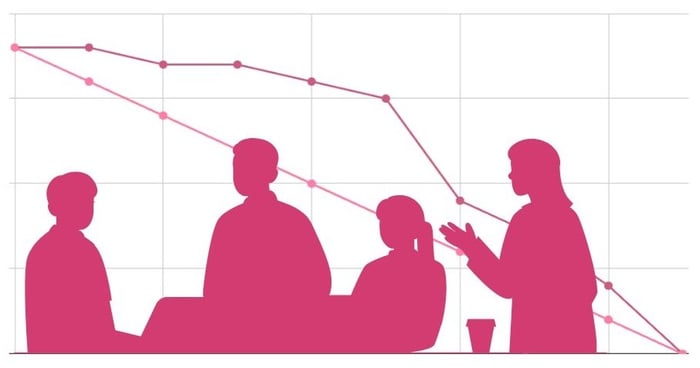
Burndown charts can be used to track your actual progress rate against your ideal progress rate.
As a project manager, using a burndown chart can be an extremely useful tool for knowing when it's time to step in and recalibrate. With a visual representation of your data, you’ll aid your decision-making and know how far ahead or behind progress is.
Given that 58% of businesses list operational efficiency as their top resource management priority, you’re making the right steps in wanting to learn more.
In this guide, you’ll learn when to use burndown charts, how to implement them effectively, and how to integrate them alongside budget management and client communication.
Key Takeaways From This Blog:
- Burndown charts are visual tools used to track actual progress rates vs. ideal progress rates.
- They can be used by project managers to aid decision-making and assess whether you’ll meet a deadline.
- You can also use them for budget spending.
- They remove the need for complex data, with a quick go-to visual solution.
- You can share them with key stakeholders, including clients, to improve transparency.
- They must be updated regularly, which can be aided with an automated system like Workamajig.
What Is a Burndown Chart?
A Burndown chart is a type of project management visual tool that plots remaining work against time. This creates a downward-sloping line that ‘burns down’ to zero as tasks are completed.
Burndown charts can be used to help teams track progress rates by replacing complex data with a quick visual summary. With one, you’ll be able to understand the impact of potential delays and know whether you’ll complete work on time.
When Should You Use a Burndown Chart?
Burndown charts can be seen as progress trackers and early warning systems.
If you work in a creative team or agile project management, you can use burndown charts to help spot when your project's progress is falling behind schedule, preventing scope creep from turning into a crisis.
They can be particularly useful within creative projects that go through multiple revision rounds, where feedback could add unexpected scope, and you need to assess the impact on time constraints.
If you’re still unsure, here are some good use cases:
- You want to understand your current rate of progress within a project with a relatively stable scope of work.
- You want to track daily progress in a sprint.
- You want to monitor work across a release made up of multiple sprints.
- Your creative projects often go behind schedule, and you need a clear way to understand how this impacts your workflow.
Examples of Using a Burndown Chart in an Agency Setting
- A software team is running a 2-week sprint and wants to see if they’ll finish all their planned development on time.
- A project manager is watching whether task completion is keeping pace with a strict, fixed deadline.
- A design team needs to add tasks mid-sprint and wants a visible way to show the impact on their schedule.
How to Read a Burndown Chart
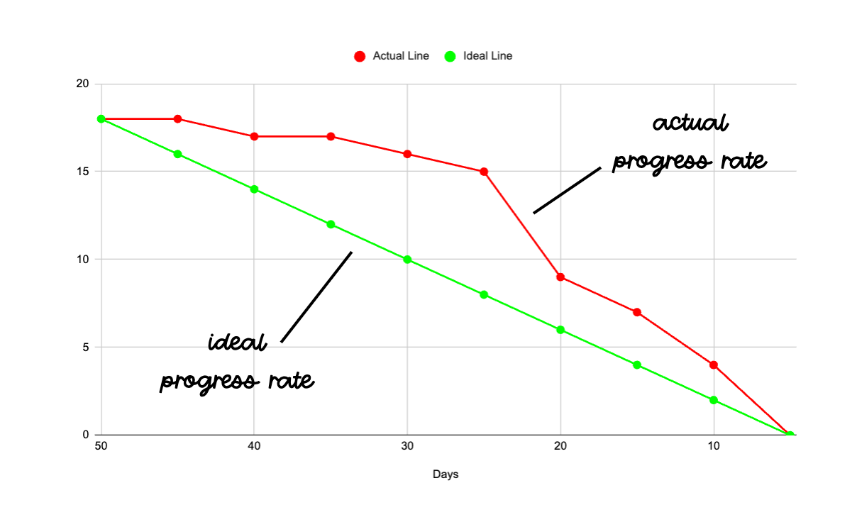 Here’s an easy-to-understand overview of how to read burndown charts:
The X and Y Axis:
Every burndown chart has two simple dimensions:
- X-Axis: Shows the project’s timeline, stretching from day one to the end of the sprint or final deadline.
- Y-Axis: Shows the remaining amount of work, measured in tasks, story points, or other relevant metrics.
The ‘Ideal’ Line
The ideal line is a perfectly straight diagonal line that displays the pace needed to complete the total work by the deadline. Its points display when tasks should be completed by.
You’ll notice it 'burns down’ from top to bottom, hence the name.
The ‘Actual Work’ Line
The ‘Actual Work’ line is the second line, which displays your real daily progress.
It reveals where your team is in relation to the ‘idea’ schedule, so you can rapidly identify if you’re ahead or behind schedule.
- If your actual line is above your ideal line, it means you're progressing more slowly than planned.
- If your actual line is below your ideal line, it means you’re ahead of schedule!
Identifying Warning Signs
The following trends in your actual line may also suggest problems that need attention:
- Flat periods suggest blockers, delays for client feedback, or that team members are focusing on non-tracked work.
- Sharp drops suggest bulk task completion, scope reduction, or team members who are catching up.
- Steep gaps between lines suggest a need for urgent corrective action, such as resource reallocation or scope adjustment.
How to React to a Burndown Chart
Once created, a burndown chart can be used throughout your project to track how on schedule you are. Here are some ways you can then take action to benefit from it:
Adjust the Current Sprint or Project
If your team is behind the ideal progress rate, you can reprioritize tasks by removing low-value items or bringing in extra help to catch up.
If you’re ahead of schedule, you can question whether you can expand the scope or if too many corners are being cut. Or, maybe your team is just great?
Improve Sprint Planning and Estimates
At the end of a sprint, you can use your sprint burndown chart to analyse if your original estimates were accurate.
With this, you can refine story-point sizing and set more realistic progress expectations for future sprint goals.
Identify and Remove Blockers
You can also use a burndown chart to precisely pinpoint where things went wrong, so you know why things slow down, such as through bottlenecks or approval delays.
Communicate Progress to Stakeholders
You can also now share your burndown chart with clients or managers to display visible proof of your actual progress. This builds trust and quickly explains why changes may be needed to meet the deadline.
Types of Burndown Charts for Different Project Needs
There are various types of burndown charts to use, but the general idea is the same across all of them, with each having its own relevant Y-axis units and X-axis milestones:
Sprint Burndown Charts
Sprint burndown charts track remaining work in short iterations, usually around 1 to 4 weeks.
Scrum masters, scrum teams, and agile teams can use sprint burndown charts at daily standups to flag emerging issues and adjust accordingly.
Release Burndown Charts
Release burndown charts are a higher-level burndown chart that tracks work remaining towards the release of a product, instead of just a single sprint.
They can be used to help stakeholders understand when a product may be ready for release and to communicate scope changes or risks with a clear visualization.
Epic Burndown Charts
Epic burndown charts track large-scale initiatives that contain multiple sprints or large strategic chunks of work known as ‘epics’.
They can be used to help team and project owners see how quickly the epic is progressing and forecast how many more sprints will be required to finish it.
Product Burndown Charts
Product burndown charts cover the entire project, often measured in months or quarters. It illustrates how quickly the overall backlog is being depleted, and helps to understand long-term progress rates.
Budget Burndowns
Agencies can also use burndown charts for their budgets, with the vertical axis representing the remaining budgets (instead of tasks).
This can help you understand your actual resource use rate in relation to your plotted ideal budget rate.
How to Create a Burndown Chart (Step-by-Step)
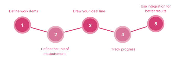
Burndown charts can be created relatively simply by following these steps:
1. Define the Work Items to Track
First, define what work you want to track (such as a sprint, release, epic, or product).
Then, you can list all the tasks, sprint backlog items, or milestones that you’ll need to complete in order to measure progress.
2. Define the Unit of Measurement
Next, choose a unit for the vertical axis that will measure your rate of progress.
Most teams use hours, but you can also use task count or any other relevant unit.
3. Set a Timeline and Draw Your Ideal Line
You can now establish the start and end dates, placing them on the horizontal axis of the graph.
Then, you can draw the ideal line. This should be a straight line from your first task to zero at your completion date.
This line represents the ideal rate of progress, so you can know if you’re ahead or behind schedule.
4. Track Your Progress and Update the Chart
Now that your burndown chart is all set up, you can begin to track daily progress by recording remaining effort each day.
This will create the ‘actual’ progress line, which shows real performance against your ideal line.
Remember to update the chart consistently, ideally during daily standups and check-ins, to ensure it’s a tool everyone is keeping an eye on.
5. Use an Integrated Tool
You can save yourself time and deploy burndown charts throughout your organization by using an automated tool.
Workamajig will provide dynamic, real-time updates to your burndown charts for all users with each new data entry.
Burndown Charts vs. Burnup Charts: Which Should You Use?
There are also ‘Burnup’ charts, which track how much work has been completed, instead of how much is left.
Burnup charts can be used to track what you’ve done. Many creative teams use them for a more positive approach, as it gives a sense of progress, rather than fear.
They can be especially useful for agency client work where deliverables and timelines are defined upfront.
We recommend the use of a burnup chart when:
- Your project has a frequently changing scope, which you want stakeholders to see.
- You want to show your team’s productivity for positivity.
- Your leadership or clients care more about what’s been delivered to date, instead of what’s to come.
Best Practices for Using Burndown Charts in Creative Agencies
Burndown charts work best when made simple. They should be a quick go-to when someone wants to understand the current and predicted progress rate.
We recommend the following practices to make the most of them:
Keep Scope Clear and Realistic
Remember to define the sprint or scope using specific deliverables. This helps the chart reflect real progress that your team and client can see, and not abstract concepts.
For example, a design team should use story points like ‘logo mockup’, ‘animated logo concept’, rather than something vague like ‘design work’.
Automate Data Collection
You can reduce manual input by using an automated system for data collection, like Workamajig. Not only will this create a real-time burndown chart, but it will also remove the chances of human error where someone forgets to update it on time.
Keep the Chart Simple and Visual
Remember that a burndown chart is a visual tool. It should always be a simple line graph with an ideal line and an actual line. So avoid overly complex overlays that will only confuse account managers or clients and defeat their entire purpose.
Use simple labels on each axis so it’s easy to understand at first glance.
Use Burndowns for Fixed-Scope Campaigns, Not Fluid Work
Burndowns are best suited to sprints and projects where the deliverables are stable. If the client is likely to constantly change the scope, then you might be better off with a different visual tool, so your team doesn’t misinterpret the chart as ‘off track’ when the work was simply added or removed.
Reserve Time for Client Feedback and Revisions
Reserve time in your ideal line for client feedback and revisions, as these are almost always inevitable. If you don’t have these, you'll almost certainly go behind schedule, reducing the true potential of the tool.
Combine Burndown Charts with Other Tools
We recommend combining burndown charts with other project health indicators like:
- Kanban boards to see where work is piling up.
- Gantt charts to show project timelines and dependencies.
- Dashboard-style reporting tools, to gain real-time updates on your burndown chart and the ability to quickly adjust the chart’s data in a single, shareable view.
Common Burndown Chart Mistakes and How to Avoid Them
Failing to Account for Review Cycles
Creative tasks come with unpredictable review cycles. If you don’t account for these, you’ll always be setting unrealistic burndown expectations.
To get around this, ensure you put some breathing room between key story points for client feedback, revisions, and approval processes.
Letting Quality Slide
A nice downward line indicates a good progress rate, but doesn’t necessarily reflect the quality of the work. So, don’t neglect paying attention to the client's satisfaction or cut corners on team feedback cycles.
Using to Judge People
If you start to judge individual output purely on a burndown chart, it encourages gaining the numbers instead of honest tracking.
We recommend understanding why a team member may be ahead or behind the ideal line, rather than assuming it’s just about effort and performance. For example, there may be space to expand the scope, or there may be blocks that are causing them trouble.
Not Updating Enough
Most importantly, burndown charts fail when they’re not updated frequently. This is a common problem in busy periods.
To avoid that, update it during daily standups so it stays current, or use an automated tool.
Why Workamajig's Integrated Burndown Chart Is a Must
Workamajig is a project management software designed for agencies and makes burndown charts even more powerful, with all your data and team members under one roof.
Here’s a closer look at how it takes them to the next level:
Real-Time Time Tracking
Workamajig automatically updates burndown charts in real time as team members log hours and progress is made. So, there’s no more manual chart maintenance.
Unlike standard burndown charts, which only show task completion, Workamajig also integrates with calendar systems that capture meeting time and client calls, and even financial data to provide a complete picture that generic charts miss.
We believe this to be crucial, as using burndown charts in isolation without connecting them to key data can leave your true understanding of your actual work in the dark.
Data Driven, Yet Easy Decision Making
Burndown charts are just one methodology to track project health with Workamajig. But there’s far more.
In real time, you’ll see color-coded warnings that alert you to tasks that risk exceeding their time or budget thresholds.
You can also benefit from templates (either presets or custom) that are purpose-built for tracking different creative work types, from campaigns and website builds to sprints and logo designs. So, whether it’s a burndown chart or a Gantt chart, you can make proactive decisions without all the hassle of manual data digging.
Simultaneous Multi-Project Burndown Views
Any agency manager will know that assessing progress across multiple client projects can be a nightmare. But Workmaajig makes that easy, with the ability to view multiple burndown progress charts simultaneously, so you can quickly identify where to take action!
We also know that some people just need a simple high-level summary, which is why there are executive dashboards for simplified overviews.
Client-Facing Project Dashboards
Workamajig also provides client portals that give your clients the opportunity to gain real-time visibility into project progress.
They’ll be free from all the overwhelming details of internal workflows, and all you have to do is share the link or let them log in.
They’ll see automated project status updates with customizable views, so they can quickly understand your progress and gain an increased trust in your work.
How to Create a Burndown Chart in Workamajig
Here’s a closer look at how you can get started with burndown charts in Workamajig:
Getting Started: Enabling the Feature
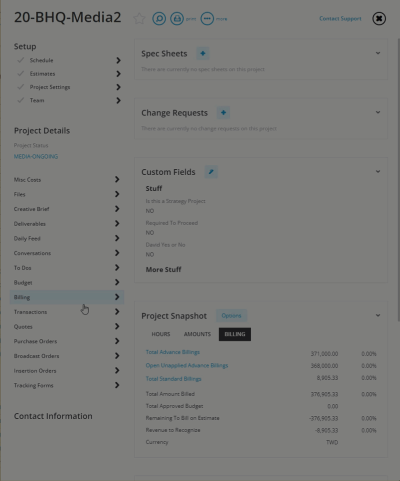
- From your project dashboard, click the “...more” option
- Select “System Settings.”
- Check “Burn Chart”
- Hit “SAVE.”
- Refresh your browser tab or reopen the project dashboard.
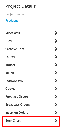
To access the chart, simply scroll down the project details on the left side of your Workamajig interface and click “Burn Chart” to view your data.
Reading Your Workamajig Burndown Chart
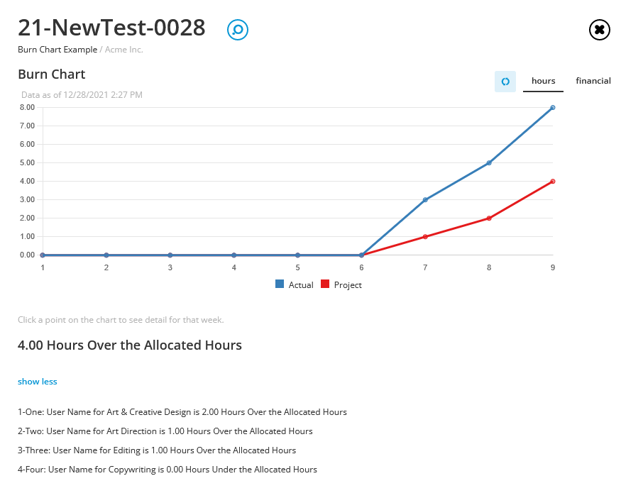
Your burndown chart displays weekly data in two helpful ways:
- Hours tab: Compares your allocated hours against actual hours entered
- Financial tab: Shows the gross financial value of planned hours versus actual time logged
Both tabs tell the same story from different angles (if one shows you’re trending over, the other likely will too).
The blue and red dots represent your actual work line and your projected allocations, respectively.
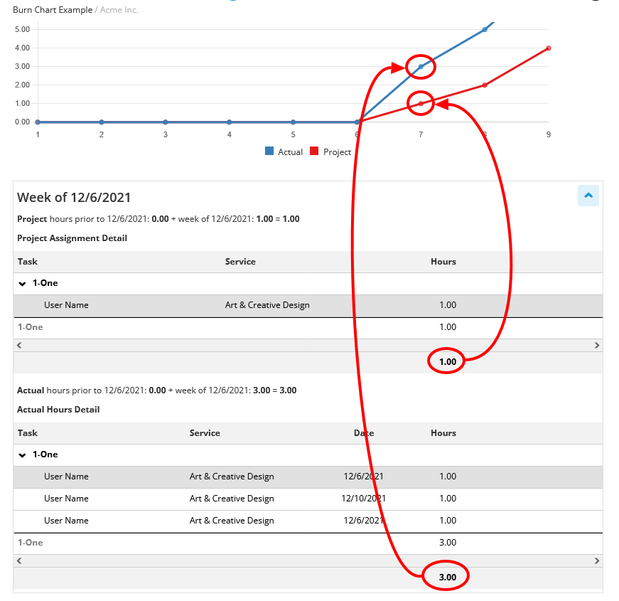
Clicking on any dot on the chart will give you a more detailed breakdown of how each week’s hours contribute to the overall picture, helping you identify specific areas that might need attention.
Pro Tip: For the most accurate picture, use “Pull From Schedule” from your estimates to keep budgets, allocations, and actuals aligned.
If you’d like to receive a free demo to see the extent of how Workamajig can transform your agency, feel free to contact us today.